Thor (2011) Film Analysis Homework
Language
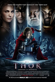
The title, actor's names, tagline and layout are all key conventions of a film poster. The huge font size as a title attracts the audience as it catches the eye and draws attention to the poster. The main title also looks as if it is made in metal which could be a reference to Mjolnir - Thor's hammer. The movie poster incorporates staging effectively as the protagonist is wielding his hammer. This is effective as the main protagonist is a super hero, and superhero stereotypically have weapons and are strong. Superhero's also wear red capes so that also gives the audience a sense of regality. To be sure to catch the viewer's attention, Marvel have made the background around the main image blue, to make the protagonist's red cape a focal point. In addition to this, red can connote to anger which foreshadows what could happen in the movie as well as subliminally suggest that Thor can be aggressive. The bright white lights in the poster can also connote to lightening, which is a reference to Thor being the God of Thunder, which both fans of the Marvel comics and Greek Mythology fans would pick up on.
Industries
This film is a Marvel Studios production which is owned by Disney. It was executively produced by Kevin Feige who is well known for producing box office films. Marvel Entertainment as a whole are associated with superhero/action films. The strap line informs the audience who the movie is made by and also adds to the overall image. It was commercially successful in 2011 (with $449,326,618 in box office worldwide) With a production budget of $150,000,000 (worldwide box office is 3.0 times production budget) The casting directors also had chosen multiple well-known actors (Natalie Portman, Idris Elba, Tom Hiddleston, Chris Hemsworth and Anthony Hopkins) on the poster to draw attention and viewers who may not necessarily look at the film poster.
Audience
The certificate for the film was a 12A, which is the rating which most film companies go for seeing as it means the film is open to all ages, it shows that the film is not directly based at a certain age range and could be enjoyed by all ages and demographics.Young kids love superheroes as well as the adults who grew up with these movies. The action parts would most likely appeal to males especially since it was a comic book first.
The focal picture shows one main character in the centre of the poster and above that there are 4 large faces. The first is a woman who is looking into the camera with a soft look and therefore it is suggested that she is the main character love interest. Beside her is a man who has a mischievous look and bright green eyes. There is something supernatural about his eyes; they are scarily luminous. This tells us that he is a villain and the green in his eyes suggests that there is some kind of jealousy towards the main character. This also suggests that that these characters are binary opposites with the centred character representing good and the green-eyed character representing evil. At the end of the four people, there is a man with orange eyes. He looks very serious however the warmth of his eyes suggest that he is on the hero’s side. The protagonist on the film poster is a male (Chris Hemsworth) which perhaps reinforces the stereotype that superheroes are male. The women on the left - she is projected more as the damsel in distress rather than a fighter which also reinforces the stereotype that women in action films are rather associated with romance rather than action.

Comments
Post a Comment